

Back in the day, kids used to brag about their ability to recognize the logos of all the car brands. Chances are you’ve had a friend who considered knowing logos a sign of superior intelligence. But now it seems that car logos are disappearing.

“How come car logos are disappearing?!”, some readers will exclaim into the void of space. In the past, the body of a regular car was marked by two graphic logos – one at the front and one at the back.
It was never a rule without exceptions though. Sometimes manufacturers stuck the logo only on the front of the car and wrote their full name on the back. But many cars had their brand logo on both the front and the back.
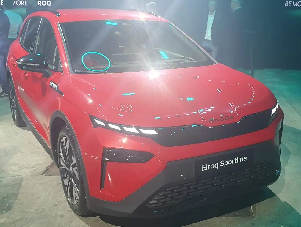
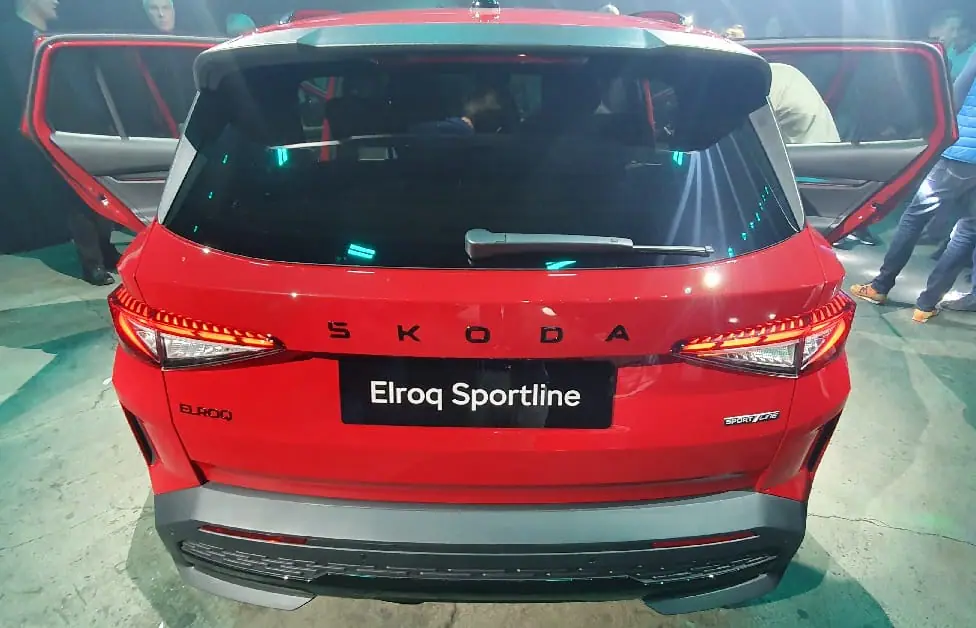
And here comes the Škoda Elroq, which does not have the usual Škoda logo on the front or the rear. It was replaced by the inscription ŠKODA. More precisely, SKODA, which is actually somewhat irrationally irritating.
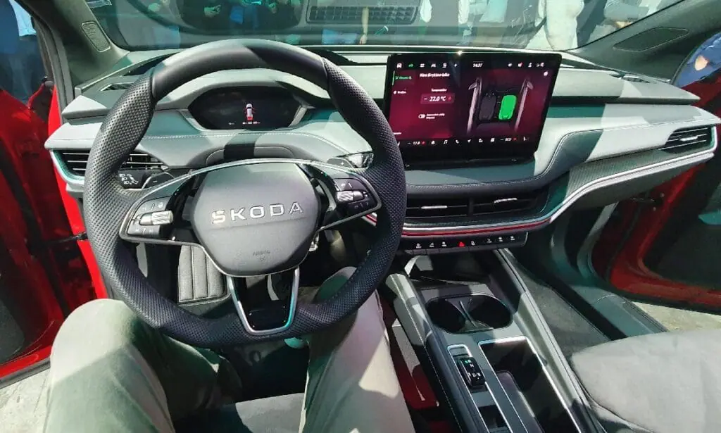
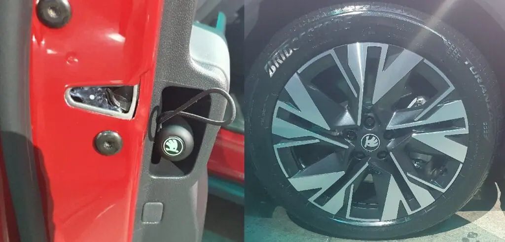
There is no regular Škoda logo on the Elroq’s surprisingly sleek nose, nor on the boot lid. It can be seen on the rims and the umbrella handle, but those parts can be changed. The traditional Škoda’s winged arrow is in the shadow. Even the steering wheel is not decorated with an old-school round logo.
The Elroq will certainly not be the only Škoda car without logos. Furthermore, more and more car brands are writing out their names in large typographical badges. We are talking about Škoda here, but this explanation will apply to other manufacturers as well.
What happened to the Škoda logo?
This story begins not with the Elroq, but with the Vision 7S concept car, unveiled back in 2022. The Vision 7S is not that similar to a much smaller Elroq, but it was the one that introduced Škoda’s new design direction and the new branding. Škoda explained that the conventional winged arrow will give way to the stylized ŠKODA inscription (wordmark) in many places, as it will make the brand more recognizable.
Being recognizable is important. There are permanent car brand logos – Ferrari’s prancing horse, Audi’s rings, Maserati’s trident, etc. The Škoda logo is not among them. Škoda cars are very popular in Europe but you may have just now found out that their logo represents a winged arrow.
To Nodum.org‘s question about the decision to choose a typographic logo over the traditional one, Škoda Auto product spokesperson Jiří Brynda answered that when entering new markets it is very important to give people the opportunity to memorise the brand name. Those new markets are India, Kazakhstan, Middle East. People don’t want to buy unknown things, especially cars and tools. Constantly seeing the word ŠKODA on the streets will make potential car buyers more likely to accept the brand, even if it is new in that particular market. Škoda, by the way, did not make this decision blindly – they performed research which revealed that the Škoda name is more well-known than its graphic symbols.
That wordmark will be seen not only on cars, but also on advertisements, showroom signs and everywhere else. It does look like SKODA instead of ŠKODA though to be more international. That very Czech caron above the S is still there, but seamlessly integrated into the top of the S.
Finally, it is interesting that the decision to replace the small round graphic logo with an inscription influenced the design of the car. The nose of the Elroq features an indentation that frames the new wider logo and extends across the bonnet. That groove is visually echoed in the spoiler above the rear window.


